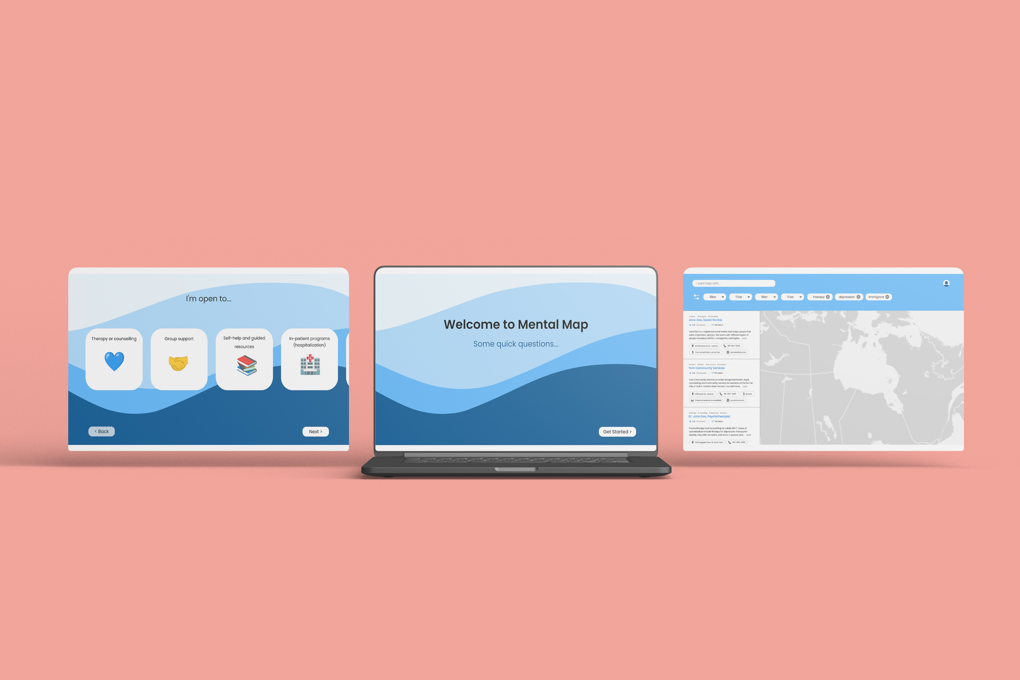
A platform to help people take the first step of their mental health journey
Hack for Good 2022 2nd place
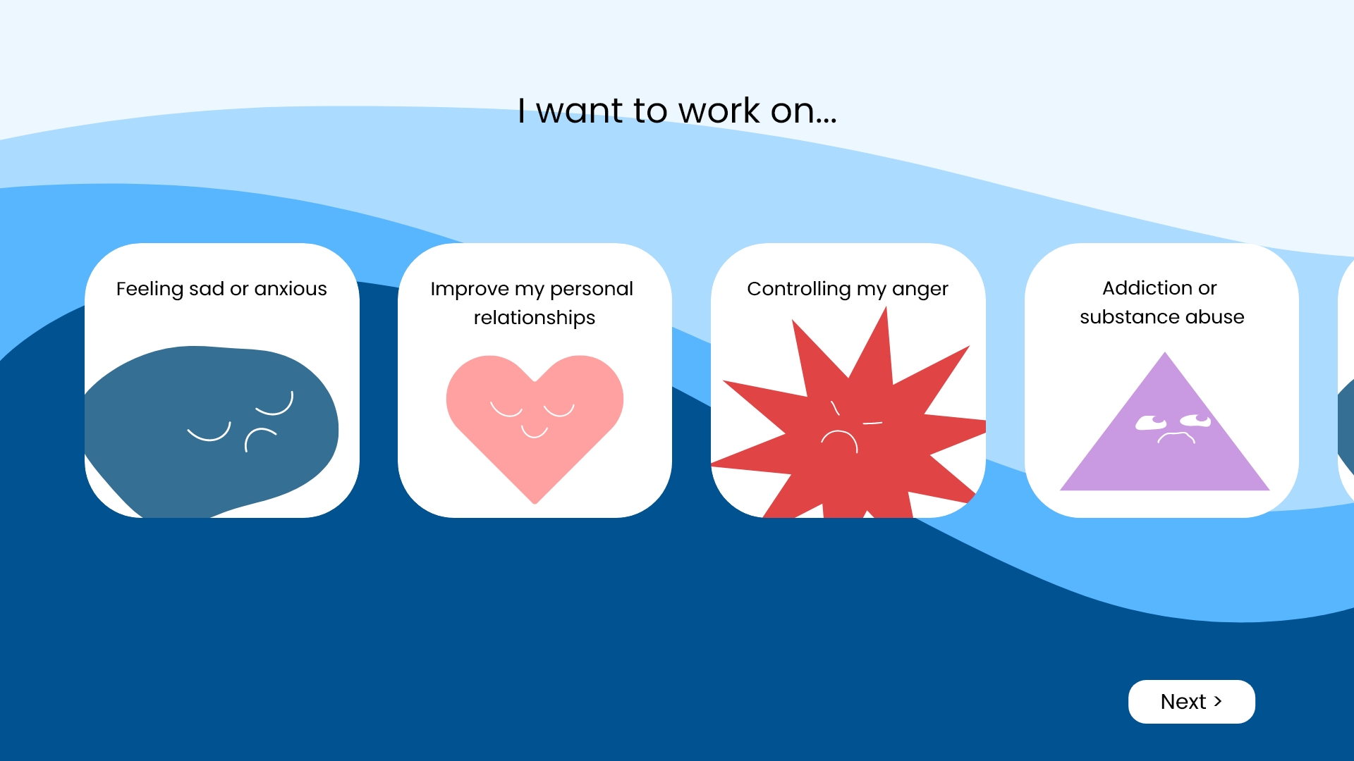
Mental Map consolidates mental health services and resources into one easy to use platform. Users start by choosing what problems they want to work on and what methods they're open to trying. Later on, they can create a profile and answer more questions about their preferences and demographics to get more specific results and keep track of previous searches or saves.
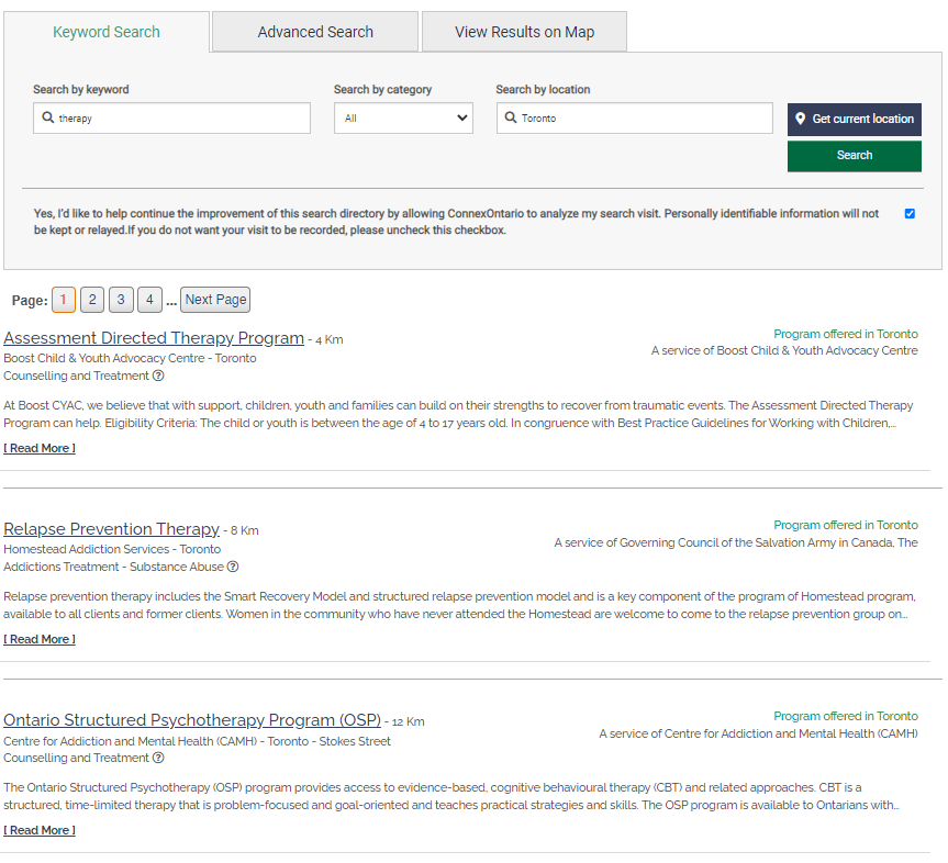
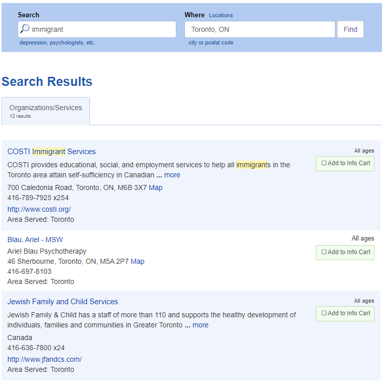
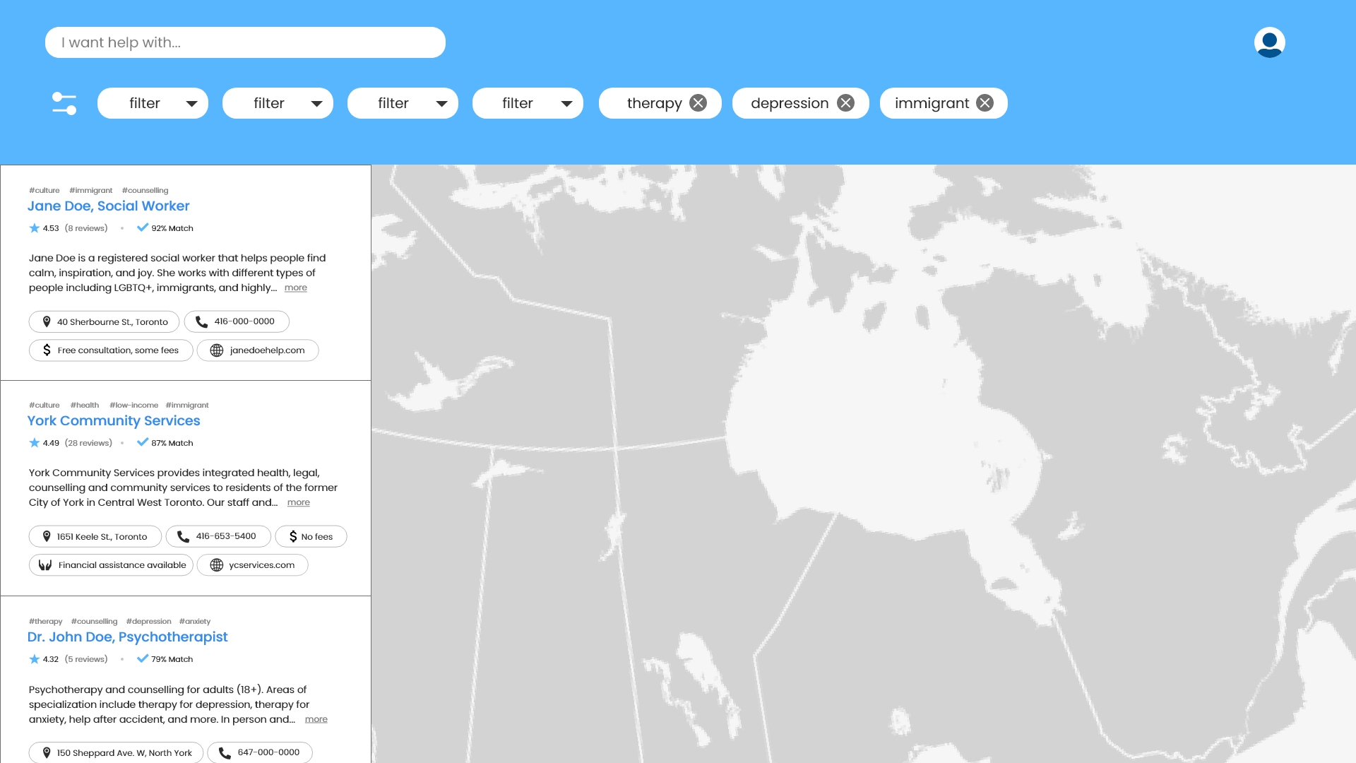
While brainstorming, we decided to try to find a service as if we were in the shoes of someone that would need one. We went on several websites meant to help people look for a service (both private and government) and found that existing websites that help users browse through available services display information in an overwhelming way and doesn't include information such as fees, whether they're a government funded program, or areas of focus.
We looked at different barriers to access mental health resources and found that while there are many barriers like lack of knowledge, culture and language barriers, and social stigma, we wanted to focus on the financial aspect. The cost of services not covered by private insurance plans (eg, coverage typically ranges from only $400 to $1,500 annually, covering only 2-8 therapy sessions) on top of 30% of Canadians paying out of pocket for mental health services (Moroz, Nicholas, et al., 2020) and prevents many people from seeking help even after overcoming other barriers.
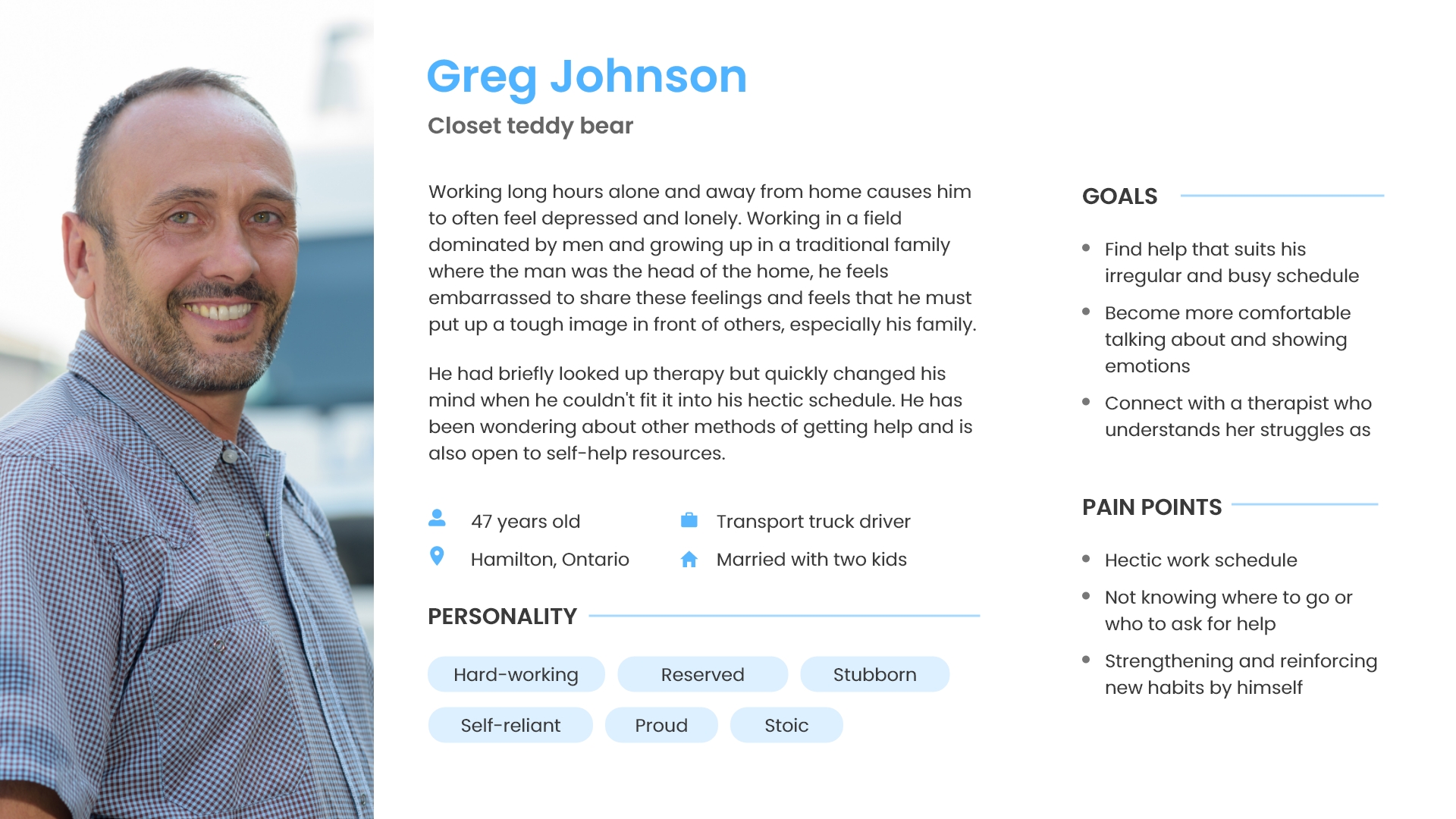
While the developers began a skeleton of the coded prototype, I did some more research and created some personas and user journeys to help us better understand potential users and how we could improve existing products. While I created 3 different personas to get a better range of problems and needs of users, we focused on one for the project.
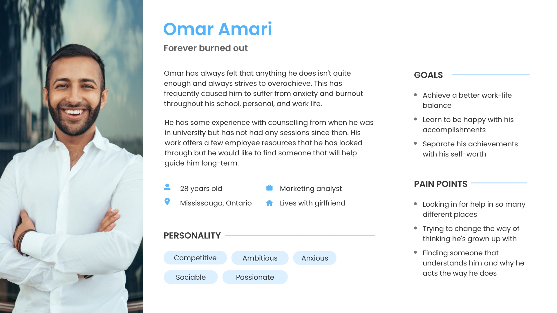
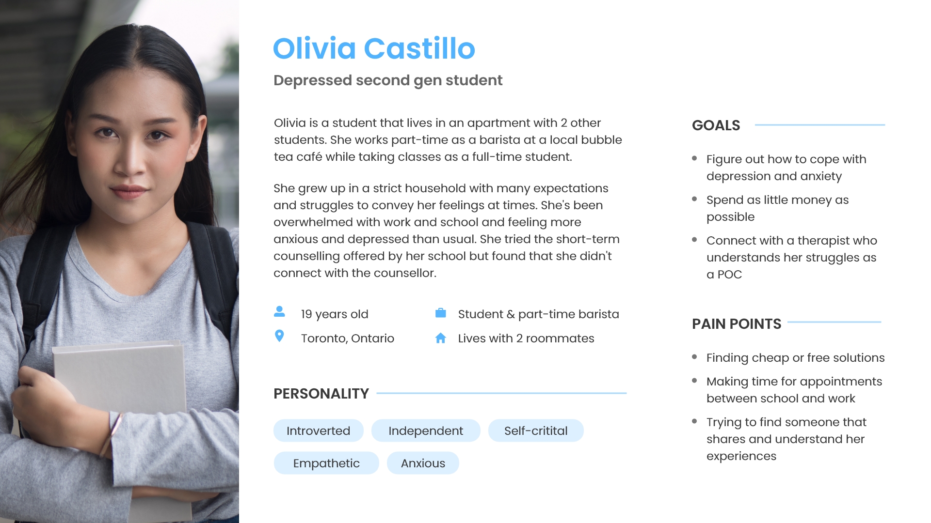
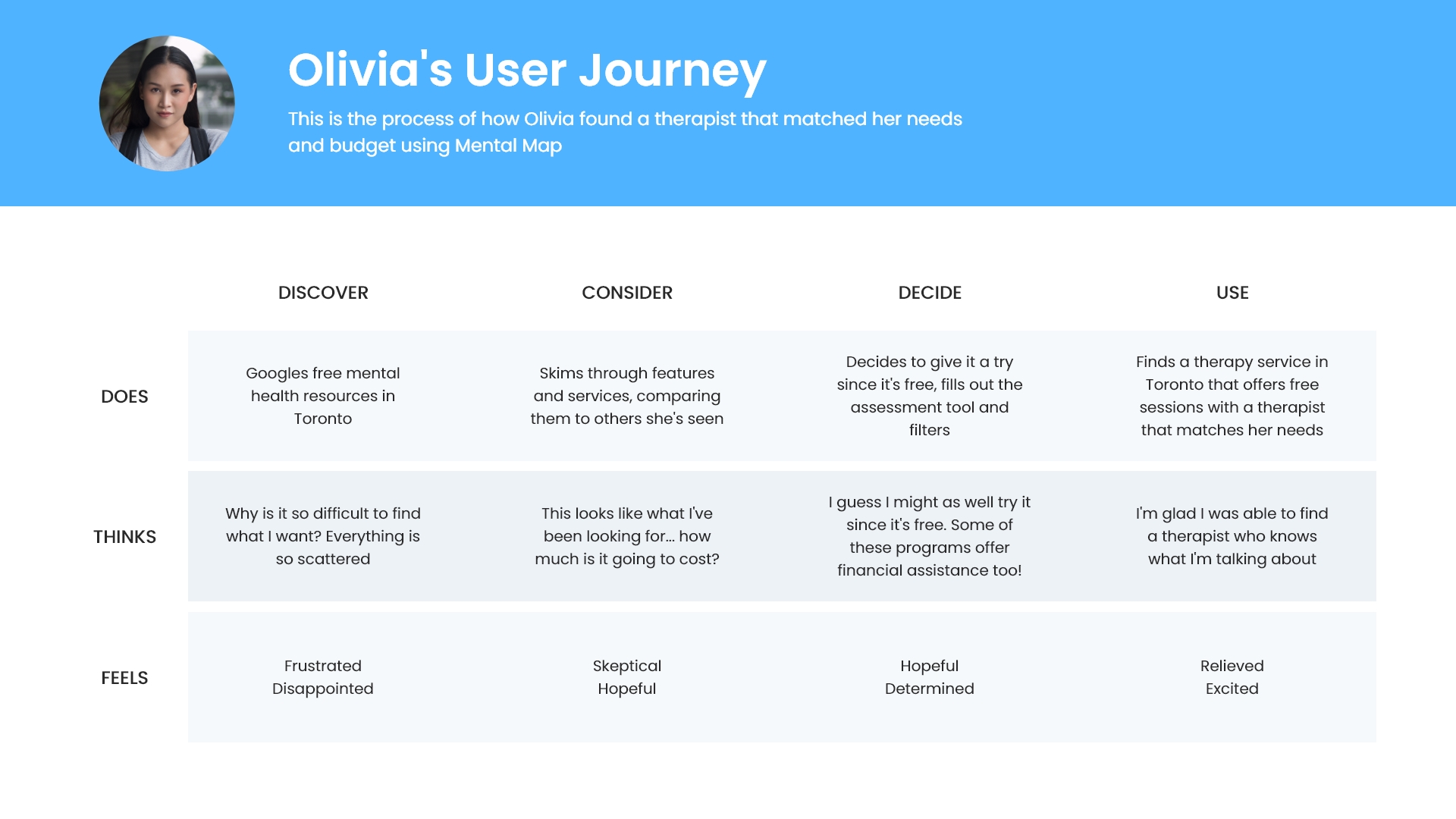
Using Adobe XD, I created a basic layout and onboarding for new users so the developers could start refining their code.
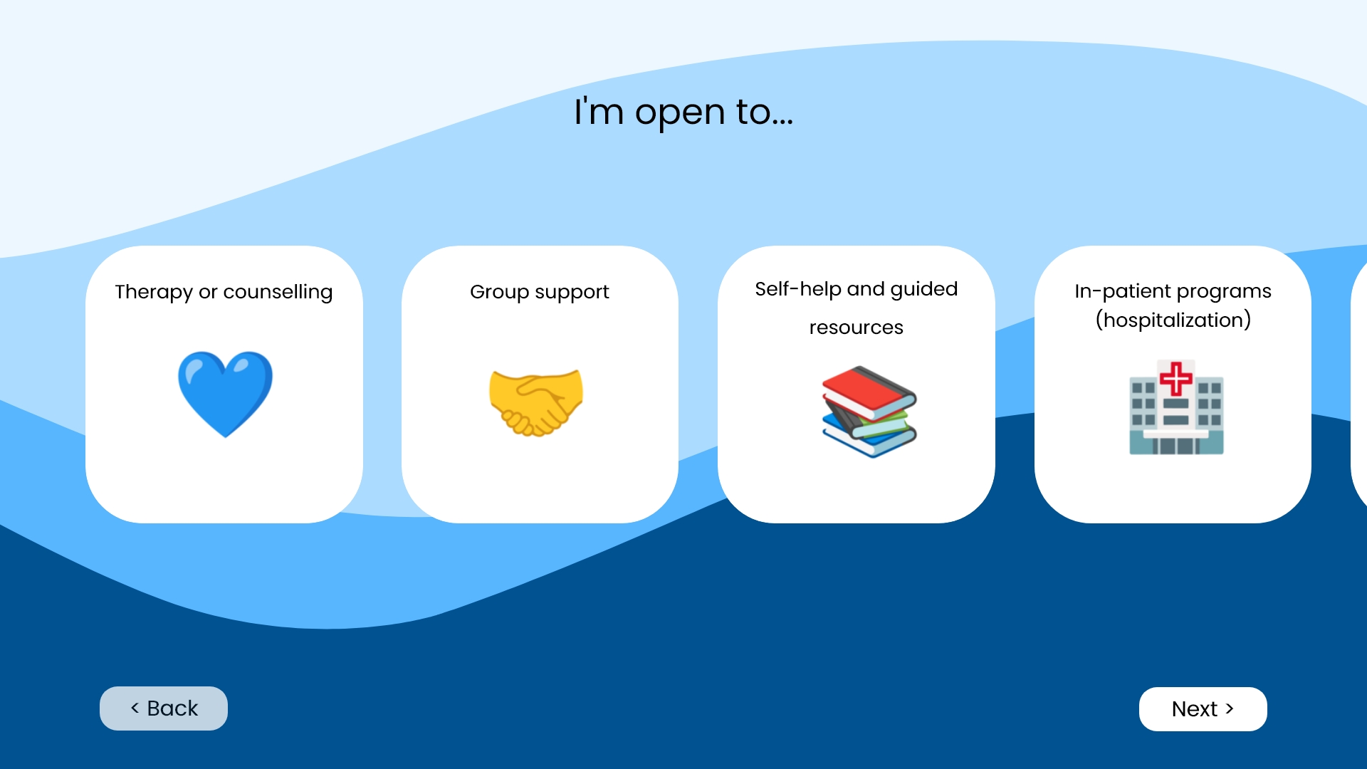
We wanted to focus on the financial point in particular since government funded programs require very long waiting lists and private services can be expensive. We felt that adding more information on fees or financial assistance programs would make people more willing to explore those options instead of being limited to just those covered under OHIP.
We also added key words from each service listed so users are able to find something that matches exactly what they're looking for.
Our idea wasn't very innovative but overall, I was really happy with what we were able to create as a team of 3 in 30 hours, especially since we placed second! It was a very different and interesting experience working with two developers as I usually work with others that have similar skill sets as me. Having to work on the UX at the same time that they were coding everything was a big challenge since we had to lay out a basic plan very quickly but keep it flexible enough where we could make changes to it later.
I feel that towards the end, feature creep also held us back and our product started to become less focused as the developers were keen to show off their (amazing) coding skills. This was a great learning experience and definitely helped me learn how to work in a team of people from different backgrounds.
.jpg)